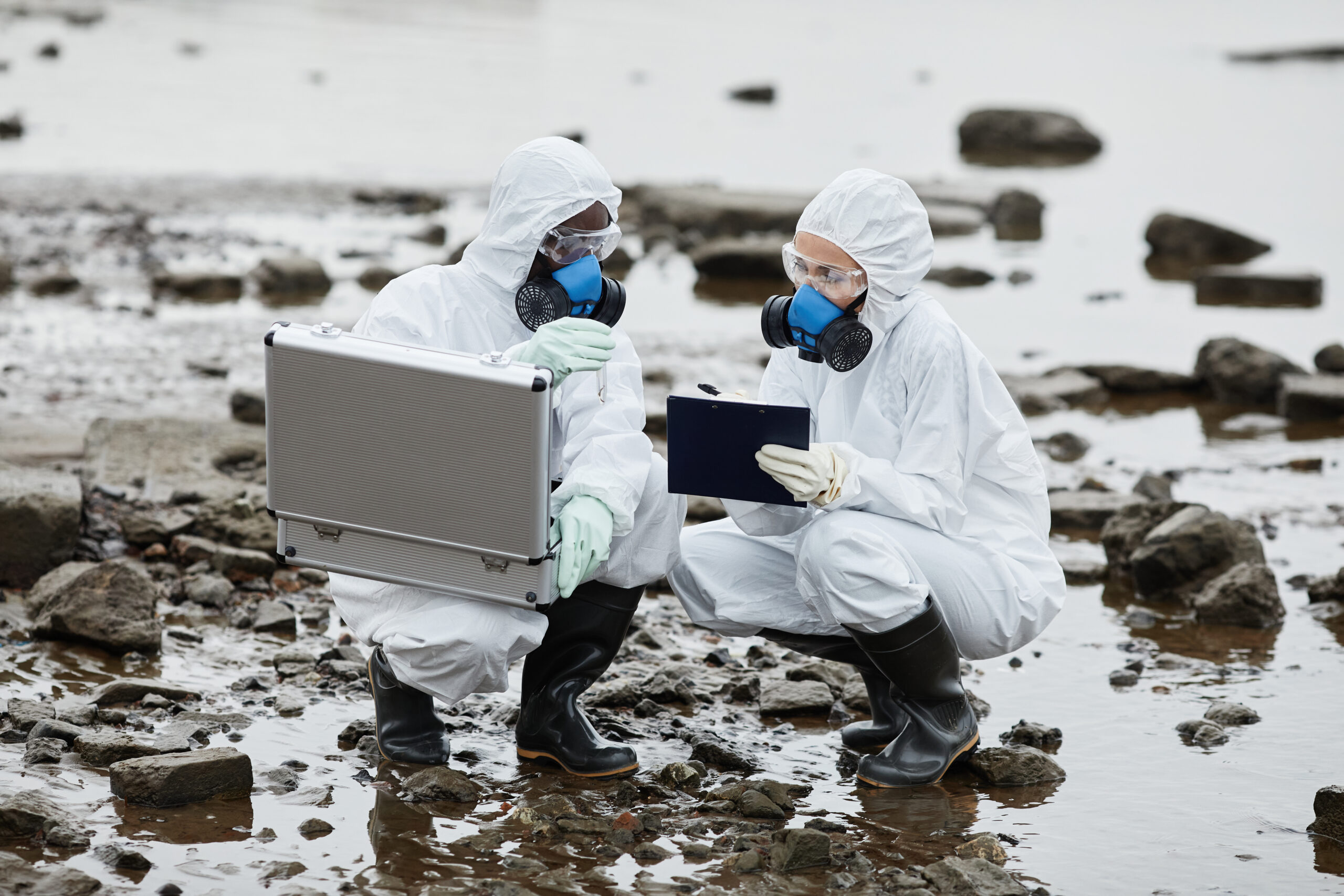
Environmental groups do great work cleaning up places, like towns and rivers. The hard part isn’t always the cleanup itself, but showing people what a difference their work makes.
Cleanups produce lots of useful information, but it usually ends up in files, reports, or internal papers. These aren’t easy for supporters, volunteers, or donors to understand. Even though the numbers are important, they don’t always show clearly what’s really going on.
Our client had this exact problem.
They had gathered a lot of environmental data from their cleanups. But they needed a better way to show it to everyone. They wanted to make their work easier to see, get more people aware, and help supporters know how much their efforts mattered.
The main problem: how to make their environmental work easier to see.
Hearing that thousands of pounds of trash were collected sounds impressive. But just numbers don’t always connect with people strongly.
The client wanted people visiting their site to easily find answers to questions like:
Where exactly did they clean up?
How much trash was picked up in each spot?
Which places benefited the most?
And how have their cleanups improved over time?
Without something visual, it was hard to get these points across.
The organization needed a way to turn their environmental data into something interesting to look at. They wanted visitors to explore the information instead of just reading it.
What we did: we made a special interactive map website.
To fix this, we built a special website based around an interactive map showing environmental impact.
This website lets visitors look at cleanup spots and immediately see how much trash was collected in each place. Instead of long reports, people can mess with the data themselves and get a much better idea of what the group is doing.
Interactive map of places.
We made a map that shows cleanup spots in a way that’s easy to see. People can look at different areas and quickly figure out where the environmental work happened.
Showing real-world impact.
Besides showing locations, the site also points out how much trash was collected at each spot. This turns plain numbers into clear, important information that anyone can get.
Clearer picture for supporters.
Supporters, donors, and local people can now see exactly how the cleanups are helping. The site makes things clearer, which helps build trust and get more people involved.
A more interesting way to share their story.
It’s often hard to explain environmental impact using just regular reports. By putting data with interactive pictures, the website makes things much more interesting and keeps people looking longer.
Easy for anyone to use.
We really focused on making the site easy to use. We designed it so anyone, even if they aren’t good with computers, could look at the map and understand the information without feeling confused.
We built a special website with an interactive map that shows cleanup activities. It displays where cleanups happened and how much trash was picked up. This makes it easier for people to understand the environmental impact and helps the group explain what they do better.
What happened.
The finished website gave the client a totally new way to show what their environmental projects achieved.
Instead of just using reports and numbers, they now have an interactive site that makes their data come alive. Visitors can quickly see where cleanups happened, how big of a difference was made, and appreciate the group’s work more.
The site also made it simpler for supporters, volunteers, and others to get involved. It shows ongoing environmental efforts clearly and openly.
How this helped the group.
This solution helped the client:
Show what their environmental cleanups looked like.
Be more open and get more people involved.
Make environmental data easier to get.
Talk better with supporters and donors.
Make their website more interactive and memorable.
Show the actual difference their cleanups made.
This project shows how smart technology can help groups share their stories better. By turning environmental data into an interactive picture, the client can now explain their impact more clearly, get more people in the community involved, and build stronger support for future projects.